Calculating CW frequencies from Audio
[code python signal-processing data EDIT: cleaned up the script a tiny bit.
The other day an amateur radio guy, @MW1CFN@mastodon.radio, poster to Mastodon a question.
Anybody know of a straightforward way to analyse the sound recordings from SAQ transmissions and plot how the frequency varies over time?
I asked a clarifying question of two, and her write this:
What I want to do is plot (as a graph, rather than a waterfall per se) the single carrier frequency (around 700Hz audio) against time, thus revealing how the carrier drifted - remarkably little, given the electro-mechanical feedback system feathering a 1.25t disc of metal spinning at 2115rpm!
I invited him to send the the audio recordin so I could chew on the problem a little bit. I felt that audio recordings of CW are simple, and I know a little about analog signal analysis from my bat monitoring days with Anabat units and Zero Crossing Analysis. He posted the recording to soundcloud (here) and I grabbed it using Audio Hijak and Fission.
It was then off to the races.
I pulled together the below python script which kicks out a visualization that doesn’t look half back, merely 25% bad. Here’s the frequency-time plot I was able to create.
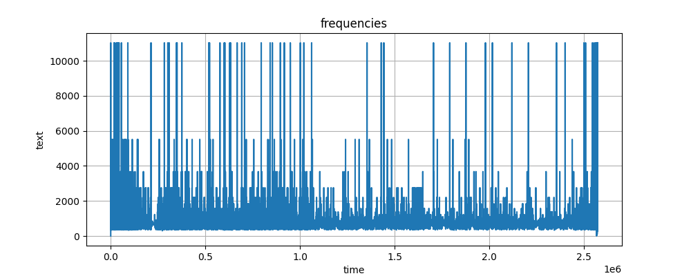
It looks like there’s some spurrious (?) doubling or halving happening in the code. But I’ll leave that for smarter people to track down.
#!/usr/bin/env python3
# -*- coding: utf-8 -*-
"""
Created on Sat Jul 06 11:08am

@author: Jason Miller (KM6PSZ)
"""

# basic idea from https://www.kaggle.com/code/vishnurapps/dummies-guide-to-audio-analysis

import librosa
import matplotlib.pyplot as plt
import warnings

import numpy as np

warnings.filterwarnings('ignore')

# load audio file as data set
# NOTE:  loads file as a time series

# here
# y is the frequency value
# sr is the sampling rate from which we can inferr the sample times

yd, sr = librosa.load("recording.mp3")

# timestep
deltat=1/sr

#number of samples in the audio file
L=len(yd)

# array of sampling times
time = [ deltat*i for i in range( L )]

# grab a portion of the audio file for analysis (to keep the size managable as I
# work to pull together some code)
#
# Here we determine which of the entries are zero crossings
logicyd=librosa.zero_crossings(yd)
logicyd1=np.split(logicyd, [20000,20400],axis=0)
# here we get the indices of the zero-crossings
zeros=np.nonzero(logicyd)

times=[time[i] for i in zeros[0]]
dtimes=2*np.diff(times)
yds=[yd[i] for i in zeros[0]]
yds=[yds[i] for i in range(len(yds)-1)]

freq=[1/dtimes[i] for i in range( len(dtimes) )]

#for debugging
print(freq)

# visualizing the data

plt.figure(figsize=(20, 4))
plt.plot(freq)
plt.grid()
plt.title('frequencies')
plt.xlabel('time')
plt.ylabel('text')
plt.show()

# NOTE:  it is my undertstanding that the zero crossing analysis can be improved by
# filtering the raw data with a mean filter.  That should be easy to implement with
# by replacing `yd` with something like
#   ydM=[1/3*(yd[i-1]+yd[i]+yd[i+1]) for i in range(len(yd)-1)]
# so long as you set ydM[0] as 1/2(yd[0]+yd[1])